
Pantone Spring Colors 2014
www.mybrandnewimage.com
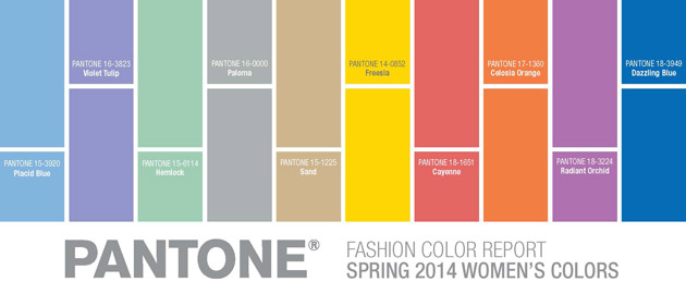
Fashion Color Report Spring 2014
Designers take a modern twist on the traditional for spring 2014 by pairing soft pastels with vivid brights to create a colorful equilibrium. Inspired by a mixture of blooming flowers, travels abroad and strong, confident women, designers use color to refresh, revive and defy conventional wisdom.
“This season, consumers are looking for a state of thoughtful, emotional and artistic equilibrium,” said Leatrice Eiseman, executive director of the Pantone Color Institute®. “While this need for stability is reflected in the composition of the palette, the inherent versatility of the individual colors allows for experimentation with new looks and color combinations.”
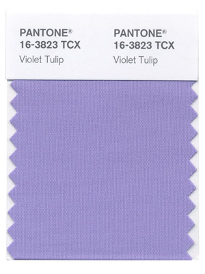
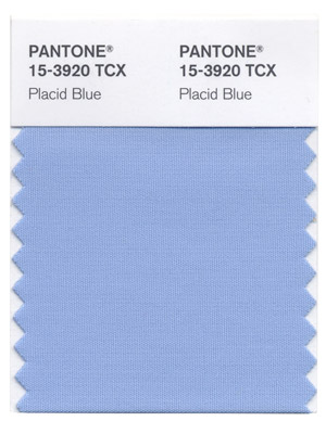
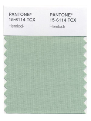
Three very adaptable pastels sit on one end of the palette, and, because we are so accustomed to seeing them as nature’s background, they can be creatively combined with any other color in the spectrum. Placid Blue, like a picture-perfect, tranquil and reassuring sky, induces a sense of peaceful calmness, while Violet Tulip, a romantic, vintage purple, evokes wistful nostalgia. Similar to the verdant shade of springtime foliage, Hemlock, a summery, ornamental green, provides a decorative touch that’s very different from the greens of recent seasons. Pair any of these versatile pastels with a bolder hue for an au courant look.
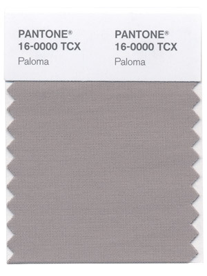
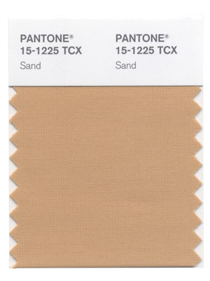
Sand, a lightly toasted and amiable neutral, conjures images of the beach and the carefree days of summer. Try pairing Sand with Hemlock for perfect, natural balance. Paloma serves as a quintessential neutral, interesting enough to be worn alone or combined with any color for sophisticated poise.
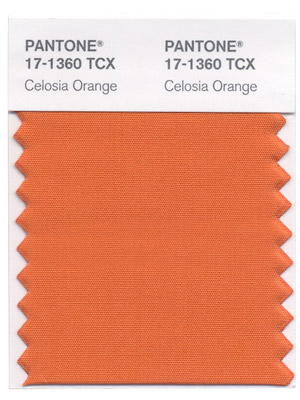
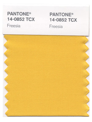
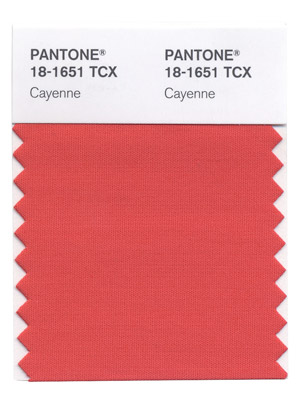
Cayenne, a high-pitched red, adds a dash of spicy heat to neutrals, and heightens the excitement when mixed with Freesia, a blazing yellow that is sure to illuminate wardrobes this season. A tropical, floral-inspired shade, Freesia’s warmth and energy help set the stage for Celosia Orange, an optimistic, spontaneous hue. Pair Celosia Orange with Violet Tulip for a captivating vision, much like the setting summer sun.
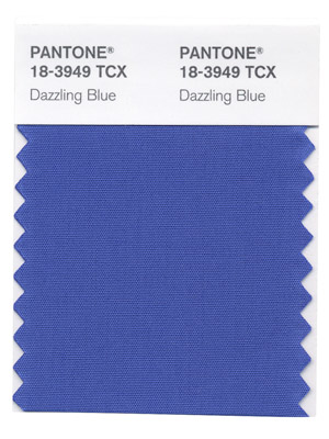
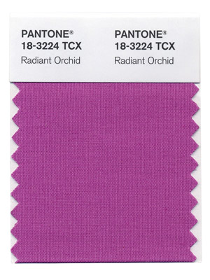
The palette is brought full circle with Radiant Orchid, a bold counterpart to Violet Tulip, and Dazzling Blue, a scintillating, polar opposite to Placid Blue. Surprisingly, these strong, vibrant colors also pair well across the palette: They are perfect companions to pastels, and add confidence and vivacity when mixed with other bold colors.
For more than 20 years, Pantone, the global authority on color, has surveyed the designers of New York Fashion Week and beyond to bring you the season’s most important color trends. This report previews the most prominent hues for spring 2014.
1. Dazzling Blue
www.mybrandnewimage.com
2. Violet Tulip
www.mybrandnewimage.com
3. Radiant Orchid
www.mybrandnewimage.com
4. Celosia Orange
www.mybrandnewimage.com
5. Freesia
www.mybrandnewimage.com
6. Cayenne
www.mybrandnewimage.com
7. Placid Blue
www.mybrandnewimage.com
8. Paloma
www.mybrandnewimage.com
9. Sand
www.mybrandnewimage.com
10. Hemlock
www.mybrandnewimage.com